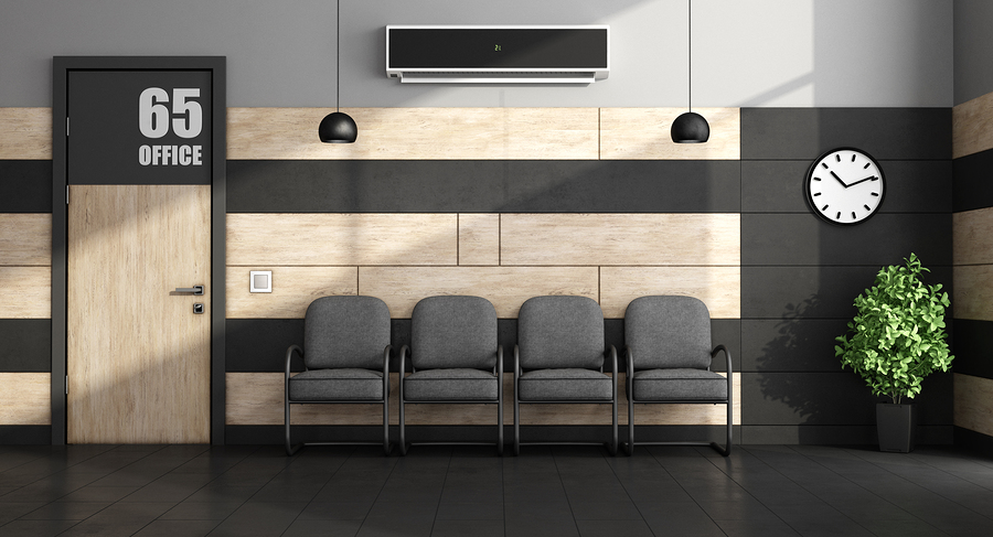
When Less is More: Minimalist Dental Office Design Ideas
Posted by HJT Design

One of the most popular trends in interior design these days is minimalism. It allows for a simplified lifestyle with less clutter, clean lines, and a feeling of peace and serenity in any space. Minimalism allows the owner to accentuate architecturally in a space, rather than filling the walls and empty spaces with bulky décor and furniture. Sometimes, “less is more” really does open up the doors for greater opportunity and satisfaction.
Minimalism is making its way into dental office design as well. Dentists are realizing that they can better focus on patient treatment and the overall patient experience when they don’t have to worry so much about wall art, trending paint colors, or ornate décor. Minimalism recognizes that patients come to the dentist for a simple cleaning, filling, or dental procedure that can usually be completed within an hour. They don’t want to be overwhelmed by crowded office spaces and over-the-top design elements.
Minimalism Does Not Mean “Empty”
Dental office interior design should emphasize on what truly matters most: quality care and a relaxing patient experience. When it comes to dental office design, floor plans that take a minimalist approach has a lot of great features.
An Open Floor Plan
Dental offices with numerous patient treatment rooms all divided by walls, hallways and extra furniture can be difficult for new patients to navigate. They can make each space look more restricted and smaller that it truly is. An open floor plan can make the treatment area feel more spacious and freeing, something very important for many patients who may already be anxious about a trip to the dentist.
Natural Lighting
Bulky lamps and ill-lit fluorescent lighting overhead can be aesthetically unappealing and sometimes ineffective. Design consultants who take a minimalist approach will create a dental office design that incorporates large windows to let in natural lighting as much as possible. Natural lighting allows the beauty of nature to illuminate the space AND provide a beautiful outdoor landscape to decorate your office.
Simple Line Furnishings
Large furniture, humongous aquariums and artificial plants can create a waiting room that is crowded and swallowed up by its surroundings. However, with a minimalistic design, simple line furnishings can create a spacious, clean and clear look for patients to enjoy. Sleek furniture designs have a contemporary feel that speaks of the times. Furniture is comfortable and modern but doesn’t detract from the focus of exceptional dental care.
Color schemes
Minimalist dental office designs focus on clean, neutral color schemes that complement nearly any room décor. Color schemes often focus on a palette of grays, creams, white, or tans. You won’t find wallpaper, borders, or flashy accent walls. Color can be added with a few strategically placed pieces of décor. Avoid busy patterns on the furniture and heavy drapery on window. Think solid colors and bare windows to allow for natural light to enter. Think clean and simple.
The goal of a minimalist dental office design is to find that balance between professionalism, service, and the overall patient experience. Patients want to know that your practice is up to date on the latest trends and advances in modern dentistry. If your office design is 20 years old, they may question if your services are not of this decade either.
The design experts at HJT Dental Design Consultants can help you refocus your dental office design and bring a minimalist feel that your patients can feel relaxed in. Contact us today to discover what your dental office could be.